This meme is actually on hiatus for a few weeks but a few bloggers are doing their own topics for a while and I've missed this post. I saw this idea on a blog last week (wish I remembered where) so I most definitely stole it. I am sharing with you covers I'd redesign if I had the chance (and the ability).
Rituals (Cainsville #5) - Kelley Armstrong. This book isn't even out yet and I already want a cover change. I love this series so much but I don't think this cover depicts what is needed for the final conclusion of an awesome series.
Heart of Stone (Old Races Universe #1) - C.E. Murphy. This is a great and highly under-hyped urban fantasy novel. I think more people should read this series, and might if it had a cover change.
I've read some V.C. Andrews (isn't a team that writes under this name now) and pretty much I've found every cover to be pretty horrible.
The Dark Elements series - Jennifer L. Armentrout. This series was pretty good but if I hadn't heard about them from others or recognized the author, I wouldn't have picked it up.
Dead Ever After - Sookie Stackhouse #13 - Charlaine Harris. This might be cheating because there are lots of better covers out there, but this particular one didn't do the series any favors.
Love Is Red - Sophie Jaff. Any clue what this one is about? I didn't know either when I grabbed it from the library. Guess what though, it's actually a really good horror/fantasy/thriller book.
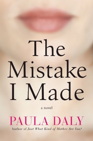
The Mistake I Made - Paula Daly. Never been a big fan of faces - full or partial - on covers. Didn't care for the book much either. Should have taken the hint.
Survive the Night - Danielle Vega. A lot of people like this book and I thought it was okay, but I've never been thrilled with the covers.
The History Major - Michael Phillip Cash. I love this author and he has even been a guest on the blog. This is probably my least favorite book though and I can't pretend to understand the cover.
Everything Belongs to the Future - Laurie Penny. Not a bad book but the cover looks like an out-of-focus Barbie doll.
So, any books you're dying to redesign?


Ergs. Yeah none of those are very inspiring. I really dislike the covers that look like 50 Shades of Grey with a random object on them. I'd redesign...all of those. lol
ReplyDeleteYou and me both! I can see why people don't mind Survive the Night, but I think the fact that I didn't love the book is clouding my perception.
DeleteRituals is a rather lackluster cover, I agree. And Survive the Night looks interesting, I remember seeing that one a while back but forgot about it. Think I was gonna read it too!
ReplyDeleteIt isn't a bad read but isn't great either. Kind of "meh." I can't wait to see what happens in Rituals though and have already reserved it at my library for when it arrives - first in line!
DeleteI detested that Charlaine Harris one when it was sent to me. It cost me some many to track down paperbacks with the cartoon covers for all the series but it was worth it not to have to look at this horror again! Why do so many covers have vacant looking or pouting models on them? I hate that!
ReplyDeleteI know. Faces on books really irk me.
DeleteDefinitely the Rituals cover - I can barely read the name of the book!
ReplyDeleteYou are right. They should have made it more prominent when they decided to go with that artwork.
DeleteI actually like the covers of Everything Belongs to the Future and Survive the Night, but the rest....yeah, they are pretty bad, or at least boring and generic.
ReplyDeleteI'm such a cover whore. All I need is a good cover and I'm so over the book.
DeleteYeah, those are all kind of bleh.
ReplyDeleteI would change any cover that's a trend. Not because they aren't nice but after awhile I can't tell them apart. lol
For What It's Worth
Yea, they could all use some more excitement in my opinion.
DeleteLove this post! yup these cover need some serious TLC. You got me all intrigued no with that VC Andrews' book. I loved Flowers in the Attic but I stop reading after the second series [which liked very much too] when I learned she wasn't the one writing anymore. But, who can resist a title like that???
ReplyDeleteI remember being in school and reading the Flowers in the Attic books were considered so taboo. Hah, we had no clue!
DeleteOh wow... Yeah I would want to change all of those covers as well! One bad cover that immediately comes to mind for me is the One For the Money by Janet Evanovich, but really that whole series. That entire series is hysterical and such a fun read! But man, those covers....
ReplyDeleteYou are right. I've seen that series time and time again but don't think I've ever picked it up because of the covers.
Deletehaha I went o read the reviews of DoD! I guess I'll pass :)
ReplyDeleteProbably a smart choice. I just saw another Andrews face book at Walmart last night - Willow. I walked right on by it!
DeleteYeah, I'm not fond of the Dead Ever After cover. I like the blood or wine but not the silhouette of the woman. Enjoy the rest of your week!
ReplyDeleteI think the original artwork for the Sookie books was such a fixture, I can't believe they fooled with it.
DeleteI can tell you're not a fan of "blurry face" covers and I can't say I'm a fan of them either. There's something very "meh" about the ones you posted here, a lot of these can definitely use a makeover.
ReplyDelete~Mogsy @ BiblioSanctum
Yep, never really noticed it but the blurry face thing is not for me.
DeleteGreat idea for a TTT. I definitely agree on all of those. I want the old step-back V.C. Andrews covers of the 80's. I'd buy those dreadful newer books written after her death just for the covers!
ReplyDeleteHaha. I want the older covers back as well.
DeleteThere are def some covers I'd like to redesign. Every time I read an amazing book with a terrible cover, it makes me wonder how many other great books I might be missing out on. And yeah, I want more people to read the books, but I know it's less likely when the cover isn't good.
ReplyDeleteI think I saw someone else complain about the UK version of Rituals as well, so apparently no one is happy with that one. And Love is Red def needs a new cover because just text?? I wouldn't have a clue what it's about either. I wouldn't think thriller/horror though.
I know. If I hadn't read the synopsis, I would have never picked it up. And it's a really good book. In fact, I think you might like it. I have the second one which just came out but haven't read it yet.
DeleteI agree with you on all of these! Rituals is so bland, and most covers with people on them are just too cringey for me to deal with.
ReplyDeleteCringey is a great way to describe them.
DeleteI have to agree with you on all of these. Not a single one of these covers makes me want to pick up the book.
ReplyDeleteWhich is so disappointing because I'm so looking forward to Rituals.
Delete